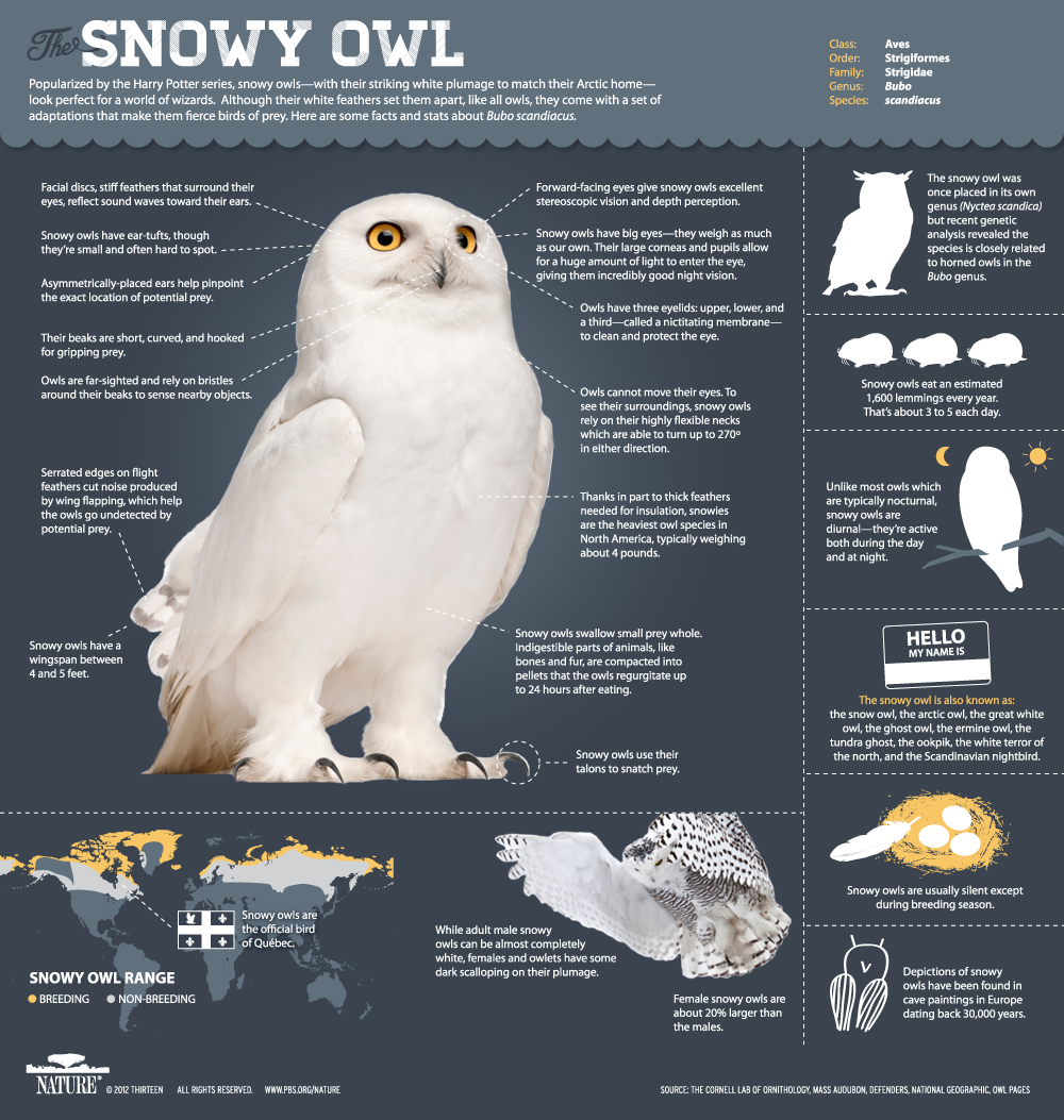
In the quiet, frozen expanses where the Arctic tundra meets the sky, the snowy owl glides like a ghost—its golden eyes scanning the horizon for prey, its feathers a masterclass in camouflage against the winter’s stark whiteness. Yet this majestic creature, a symbol of resilience and wildness, faces an invisible tide rising against it. Climate change, that relentless architect of disruption, is rewriting the rules of survival for species like the snowy owl. But here lies a powerful paradox: the very data that charts the owl’s decline can become a beacon of awareness, a tool to shift perspectives and ignite urgent action. Climate change data visualizations are not just cold numbers on a screen—they are stories waiting to be told, narratives that can pierce through apathy and reveal the fragile threads connecting species, ecosystems, and human futures.
The Power of Visual Narratives: Why Data Must Speak in Images
Humans are wired to respond to stories, not spreadsheets. While raw climate data—rising temperatures, shrinking sea ice, shifting migration patterns—may inform scientists, it often fails to resonate with the broader public. Visualizations transform abstract figures into visceral experiences. Imagine a map where the Arctic’s ice recedes year by year, its retreat marked in deepening blues, while snowy owl sightings dwindle into faint, scattered dots. Such imagery doesn’t just inform; it evokes. It forces viewers to confront the reality that a species they may have never seen in person is vanishing before their eyes. The most effective visualizations do more than display data—they create emotional anchors, turning passive observers into active participants in the narrative of loss and resilience.
Mapping the Invisible: Geographic Visualizations That Reveal Hidden Connections
Snowy owls are nomads of the North, their lives dictated by the ebb and flow of Arctic ecosystems. A geographic visualization can trace their migratory routes, overlaying them with climate change hotspots—regions where permafrost thaws, sea ice fractures, and prey populations collapse. When these maps reveal that an owl’s wintering grounds in the Canadian prairies are now plagued by unseasonal thaws, or that its summer nesting sites in the Arctic are being encroached upon by shrubification, the threat becomes undeniable. These visuals don’t just show where the owl is struggling—they expose the why. They highlight the domino effect of climate change: a warming planet doesn’t just alter temperatures; it unravels the intricate web of life that has sustained species for millennia.
Timelines That Tell a Story: The Urgency of Temporal Shifts
Time is the silent assassin in the tale of the snowy owl. A timeline visualization can juxtapose historical data—owls thriving in vast, ice-bound landscapes—with projections of a future where their habitat is a shadow of its former self. By animating the shrinking of Arctic sea ice over decades, or by plotting the increasing frequency of unseasonal snowmelt events, these visuals make the abstract concept of urgency tangible. They answer the question: How fast is this happening? When viewers see that the window for intervention is narrowing, the call to action becomes impossible to ignore. These timelines are not just records of change; they are warnings, countdowns to a tipping point that could erase a species from the collective imagination.
Species-Specific Dashboards: Tailoring Data to the Snowy Owl’s Plight
Not all climate data is created equal when it comes to protecting the snowy owl. A species-specific dashboard can distill vast datasets into the most critical metrics: declining lemming populations (their primary prey), the encroachment of boreal forests into tundra habitats, and the increasing frequency of extreme weather events that disrupt nesting cycles. By focusing on the owl’s ecological needs, these visualizations transform overwhelming data into a clear, actionable narrative. They answer the question: What does this species need to survive, and how is climate change dismantling those conditions? The result is a tool that doesn’t just inform—it empowers conservationists, policymakers, and communities to target their efforts where they’re needed most.
Interactive Storytelling: Engaging Audiences in the Owl’s Journey
The most compelling climate visualizations are not static—they invite participation. An interactive map could allow users to “fly” alongside a snowy owl, experiencing its migration in real-time while encountering the obstacles it faces: melting ice, shrinking prey, and human encroachment. Another tool might let users adjust variables—what if we reduced carbon emissions by 20%? How would that alter the owl’s habitat? These interactive experiences do more than educate; they foster empathy. They make the abstract personal, turning a distant ecological crisis into a relatable, human-scale story. When people see themselves as part of the owl’s journey, the fight to protect it becomes their fight too.
From Data to Action: How Visualizations Can Drive Policy and Advocacy
Data visualizations are not just tools for awareness—they are catalysts for change. When presented to policymakers, they can crystallize complex issues into undeniable truths. A visualization showing the projected loss of Arctic sea ice by 2050, overlaid with the snowy owl’s declining population, becomes a powerful argument for stronger climate policies. Advocacy groups can use these visuals to rally public support, framing the owl’s plight as a microcosm of broader ecological collapse. The key lies in translating data into compelling narratives that resonate with decision-makers’ values—whether that’s economic stability, cultural heritage, or intergenerational justice. When visualizations make the invisible visible, they turn data into a rallying cry.
Challenges and Ethical Considerations: The Responsibility of Representation
Yet with great power comes great responsibility. Climate data visualizations must navigate the fine line between accuracy and sensationalism. Overstating threats can lead to despair, while underrepresenting them risks complacency. Ethical visualizations acknowledge uncertainty, avoid fear-mongering, and center the voices of Indigenous communities and local experts who have long understood the land’s rhythms. They also ensure that the snowy owl is not reduced to a mere statistic but is portrayed as a living, breathing creature with intrinsic value. The goal is not to overwhelm but to illuminate—to show the owl’s struggles in a way that inspires hope, not helplessness.
The Future of Visual Advocacy: A Call to Arms for Creators and Consumers
The fight to save the snowy owl is not just a scientific challenge—it’s a storytelling one. As creators of climate visualizations, we hold the power to shape narratives, to make the invisible visible, and to turn data into a force for change. For consumers of these visuals, the responsibility is equally great: to engage, to question, and to act. The snowy owl’s fate is intertwined with our own. Will we let its story fade into obscurity, or will we use the tools at our disposal to ensure its golden eyes continue to scan the Arctic horizon for generations to come? The choice is ours—and the data is our guide.