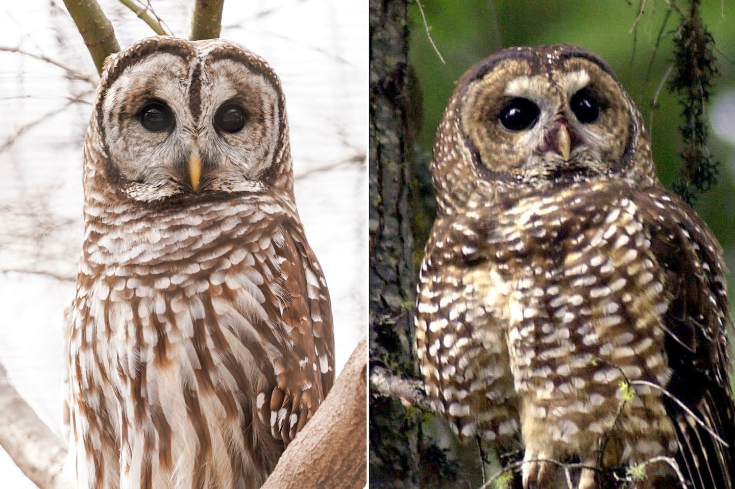
The barred owl, with its haunting, striped plumage and unnervingly human-like gaze, has long been a creature of fascination—both for its eerie beauty and its unsettling adaptability. Yet this same adaptability now threatens the spotted owl, a reclusive denizen of ancient forests whose very existence has become a battleground in the quiet war over ecological balance. The controversy isn’t just about two owl species; it’s about how we, as humans, choose to interpret and intervene in nature’s delicate choreography. Infographics, those sleek vessels of data-driven storytelling, offer a compelling way to untangle this complex narrative—not by simplifying it, but by revealing the hidden threads that bind science, policy, and perception together.
The Visual Divide: Mapping the Owls’ Divergent Realms
At first glance, barred and spotted owls seem like mirror opposites—one a bold generalist, the other a specialist of shadowed canopies. The barred owl, native to eastern forests, has expanded its range westward with unsettling efficiency, encroaching upon the spotted owl’s Pacific Northwest stronghold. An infographic can distill this territorial clash into a vivid, color-coded map: one layer tracing the barred owl’s relentless march across the continent, another marking the spotted owl’s shrinking enclaves. But the real power of such a visualization lies in its ability to expose the unseen forces driving this shift. Climate change, habitat fragmentation, and human-mediated species introductions are not just abstract concepts—they become tangible, spatial realities when rendered in data. The barred owl’s advance isn’t just a biological curiosity; it’s a symptom of a planet rewired by human hands.
The Numbers Behind the Feathers: Quantifying an Ecological Crisis
Statistics alone can numb the mind, but when paired with striking visuals, they ignite understanding. An infographic might juxtapose the barred owl’s reproductive prowess—clutches of two to four eggs, year-round breeding cycles—against the spotted owl’s more cautious reproductive strategy: one to three eggs, a breeding season confined to spring. The disparity isn’t just numerical; it’s existential. A bar graph could illustrate how the barred owl’s population has surged in regions where the spotted owl’s numbers plummet, while a pie chart might reveal the staggering 450,000 barred owls slated for culling—a figure so vast it demands a visceral reaction. Yet the most provocative infographics don’t just present data; they ask questions. Why does one species thrive in a world of our making, while the other withers? The answer isn’t just ecological—it’s a mirror held up to our own values.
Species vs. Ecosystem: The Danger of Oversimplification
In the public imagination, conservation often reduces to a zero-sum game: save one species, doom another. But an effective infographic can shatter this binary by illustrating the broader ecological web. A network diagram might trace how barred owls, as generalists, disrupt the delicate balance of old-growth forests—outcompeting spotted owls for nest sites, preying on their young, and altering prey populations in ways that ripple through the entire ecosystem. Meanwhile, a timeline could contrast the barred owl’s adaptability with the spotted owl’s dependence on a vanishing habitat. The deeper message? This isn’t just about owls. It’s about the fragility of specialized life in an era of homogenization. The infographic becomes a tool not to pick sides, but to reveal the cost of our own ecological myopia.
The Human Hand: How Policy and Perception Shape the Debate
No controversy exists in a vacuum, and the barred-spotted owl conflict is as much a product of human decision-making as it is of biology. An infographic could dissect the policy landscape with surgical precision: a flowchart mapping the Endangered Species Act’s role in protecting the spotted owl, a timeline of logging moratoriums and their unintended consequences, or a heatmap showing where barred owl removals have been proposed versus where public opposition is fiercest. But the most compelling visuals go further, exposing the cultural undercurrents that shape our response. Why do barred owls, with their eerie, almost comical calls, inspire less sympathy than the spotted owl’s haunting four-note hoot? Why does the idea of culling one species to save another spark outrage in some quarters and indifference in others? The infographic, when wielded thoughtfully, can lay bare the biases that lurk beneath the surface of even the most data-driven debates.
Beyond the Binary: Exploring Alternative Solutions
The most innovative infographics don’t just present problems—they propose pathways forward. A layered diagram might contrast traditional culling methods with non-lethal alternatives: habitat restoration to bolster spotted owl populations, translocation programs to relocate barred owls, or even targeted contraception to curb their explosive growth. Another visualization could explore the concept of “assisted colonization”—moving spotted owls to new territories before barred owls arrive—a controversial strategy that forces us to confront our own role as ecological engineers. The key is to present these options not as prescriptions, but as provocations. What if we viewed this conflict not as a battle to be won, but as a puzzle to be solved? The infographic becomes a conversation starter, a way to engage the public in the messy, necessary work of reimagining coexistence.
The Aesthetic of Conflict: Design Choices That Shape Perception
Even the most objective data is filtered through the lens of design, and in the case of the barred-spotted owl controversy, visual choices can sway opinions as much as the facts themselves. A monochromatic palette of grays and greens might evoke the somber tones of a dying forest, while a vibrant, clashing color scheme could underscore the stark contrast between the two species. Icons matter too: a barred owl rendered with sharp, angular lines might feel predatory, while a spotted owl with soft, rounded features could appear vulnerable. The most effective infographics are those that acknowledge their own subjectivity—using design not to deceive, but to illuminate the layers of meaning embedded in every statistic. The goal isn’t neutrality; it’s transparency.
The Ripple Effect: How This Conflict Reflects Broader Environmental Dilemmas
At its core, the barred-spotted owl controversy is a microcosm of the larger environmental crises unfolding across the planet. It’s a story of invasive species, habitat loss, and the unintended consequences of human intervention. But it’s also a story about how we assign value to life—why some creatures are deemed worth saving, while others are sacrificed. An infographic that situates this conflict within the broader context of the Anthropocene could juxtapose owl population trends with deforestation rates, climate projections, and even cultural representations of owls in myth and media. The message is clear: this isn’t just about two birds. It’s about the kind of world we want to inhabit, and the species we’re willing to fight for.