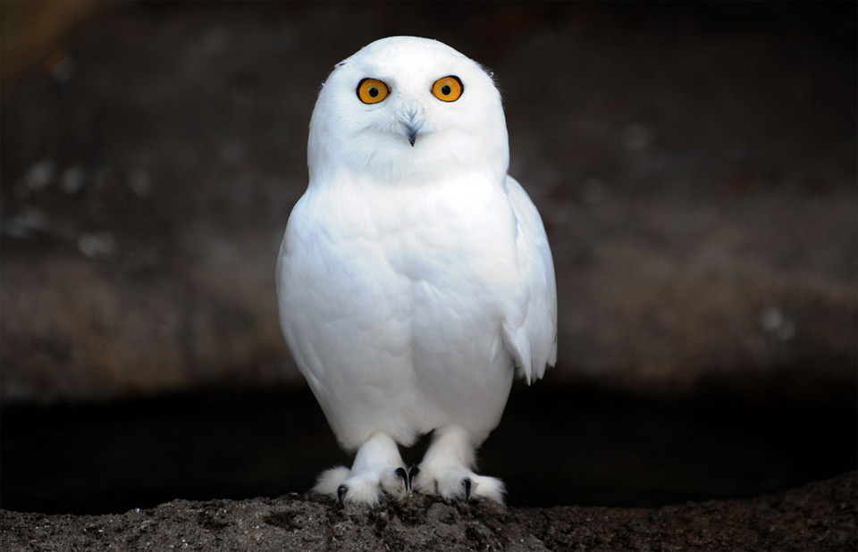
The Snowy Owl, a regal denizen of the Arctic tundra, faces an existential crisis not of its own making. As the planet warms, these majestic birds—once symbols of unyielding endurance—are caught in a tightening vise of climate threats. Their icy realm is melting beneath them, their prey vanishes into thin air, and their migratory pathways grow treacherous. But how do we convey the urgency of their plight to a world that often moves too slowly? The answer lies in the power of infographics—a visual language that can distill complex ecological narratives into arresting, digestible truths. When wielded with precision, these tools don’t just inform; they captivate, provoke, and inspire action.
The Arctic as a Melting Canvas: Visualizing Habitat Loss
Imagine the Arctic tundra as a vast, pristine canvas, its white expanse stretching endlessly under the midnight sun. Now, picture that canvas being erased, stroke by stroke, by the relentless advance of climate change. Snowy Owls, creatures of this frozen world, are losing their habitat at an alarming rate. Rising temperatures melt permafrost, transforming solid ground into slushy bogs that swallow nests whole. Coastal erosion gnaws at their breeding grounds, while shifting vegetation patterns disrupt the delicate balance of their ecosystem.
An infographic can transform these abstract threats into a visceral experience. A side-by-side comparison—one panel depicting the Arctic of the 1980s, a glittering expanse of ice and snow, and another showing the fragmented, waterlogged landscape of today—can make the loss tangible. Use a gradient of blues to white to illustrate the retreat of sea ice, with annotations marking critical thresholds: “Below 15% ice coverage, nesting sites collapse.” Pair this with a silhouette of a Snowy Owl superimposed over the shrinking habitat, its wingspan dwarfed by the encroaching void. The metaphor is clear: the owl is not just losing ground; it is being erased from the map.
The Vanishing Buffet: Tracking Prey Depletion in Real Time
Snowy Owls are opportunistic hunters, but their diet is a barometer of ecological health. Lemmings, their primary prey, thrive in cold, stable conditions. As the Arctic warms, lemming populations plummet, leaving owls to scavenge for scraps or starve. This isn’t just a dietary shift—it’s a collapse of the food web, a domino effect that radiates through the tundra. An infographic can turn this silent tragedy into a gripping narrative by mapping prey availability against owl survival rates.
Design a dynamic, layered chart where lemming populations are represented by clusters of small, brown dots. In a warming scenario, these dots dwindle, their color fading from rich umber to pale beige—a visual metaphor for scarcity. Overlay this with owl silhouettes, their numbers shrinking in tandem. Add a time slider at the bottom, allowing viewers to scroll through decades of data. The effect is chilling: as the dots disappear, so do the owls, their once-plentiful feasts reduced to a handful of scattered crumbs. To drive the point home, include a callout: “A 40% drop in lemmings correlates with a 60% decline in owl breeding success.” The infographic doesn’t just state facts; it forges an emotional connection.
Migration Maze: Mapping the Perils of a Warming World
Snowy Owls are wanderers, their migrations dictated by the rhythm of the seasons. But as the Arctic thaws, their traditional routes grow perilous. Shifting wind patterns, erratic storms, and the disappearance of stopover sites force them into uncharted territories where food is scarce and dangers lurk. Roads, power lines, and urban sprawl intersect their paths, turning migration into a deadly obstacle course. An infographic can chart these treacherous journeys, turning abstract threats into a gripping odyssey.
Use a stylized map of North America, with Snowy Owl migration routes depicted as glowing, winding paths. Highlight key hazards with red exclamation marks: “Ice roads collapse,” “Wind turbines slice through flight paths,” “Urban sprawl devours wetlands.” Animate the map to show how routes have shifted over time, with older paths fading into ghostly traces. Add a “survival score” for each segment, calculated from climate data and human encroachment. The result is a stark reminder: every mile of migration is a gamble, and the odds are stacking against them. To enhance engagement, include a quiz: “Which route would you take?”—forcing viewers to confront the choices these birds must make.
The Silent Alarm: Soundscapes of a Dying Ecosystem
Infographics need not be static. Sound, when integrated thoughtfully, can elevate a visual narrative into a multisensory experience. The Arctic is a symphony of rustling grasses, howling winds, and the distant cries of owls. As the ecosystem unravels, that symphony fades. An infographic can harness audio clips to underscore the urgency of Snowy Owl threats. Imagine a split-screen: one side plays the vibrant soundscape of a healthy tundra—lemmings scurrying, owls calling, wind whispering through sedges. The other side is a muffled, distorted version, where the lemming chatter is gone, the owl’s cry is a feeble whisper, and the wind howls through a landscape of silence.
Pair this with a spectrogram, a visual representation of sound frequencies. In the healthy tundra panel, the graph is a lush, undulating landscape of greens and yellows. In the degraded panel, it’s a sparse, jagged terrain of grays and blacks. Annotations can highlight key frequencies: “Lemming calls at 2-5 kHz—now absent.” The effect is haunting. It doesn’t just show the loss of habitat; it makes viewers *hear* it. For those who can’t access audio, a color-coded legend can translate the spectrogram into an emotional palette: vibrant hues for life, muted tones for decline.
From Awareness to Action: The Call to Arms
An infographic’s true power lies not in its design, but in its ability to mobilize. The most effective visuals don’t just inform—they galvanize. For Snowy Owls, the stakes couldn’t be higher. Their plight is a microcosm of the broader climate crisis, a canary in the coal mine for ecosystems worldwide. An infographic can serve as a rallying cry, a tool to pressure policymakers, inspire conservation efforts, and drive behavioral change.
Design a “take action” section that transforms data into a call to arms. Use a progress bar to show how close we are to critical tipping points—e.g., “We’ve lost 12% of Arctic sea ice this decade. At current rates, Snowy Owls could vanish from the Lower 48 by 2050.” Below this, provide actionable steps: “Advocate for renewable energy,” “Support habitat protection,” “Reduce carbon footprints.” Include a shareable social media snippet: “The Arctic is melting. Snowy Owls are disappearing. Will you act before it’s too late? #SaveTheSnowies.” The infographic doesn’t just end with a whimper; it ends with a roar.
The Snowy Owl’s struggle is a story of resilience in the face of annihilation. But it’s also a story of human agency—a reminder that our choices shape the fate of the wild. Infographics are more than tools; they are bridges between data and empathy, between indifference and action. By wielding them with creativity and conviction, we can turn the tide for these magnificent birds—and for the planet they call home.